Dustin Cable is senior policy researcher and statistician with the Demographics & Workforce Group at the University of Virginia’s Weldon Cooper Center for Public Service. He recently completed a “Racial Dot Map” that uses data from the 2010 census to illustrate “geographic distribution, population density, and racial diversity of the American people in every neighborhood in the entire country.”
Each dot represents one person, with each race shown in a different color. The result is a vast, visual map that Wired calls “the most comprehensive map of race in America ever created.”
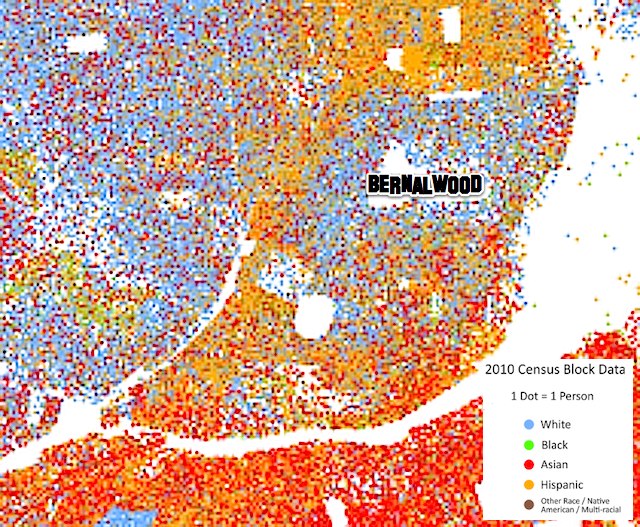
The image above is the racial dot map of San Francisco. The resolution of the interactive version of the dot map is limited, but we can zoom and enhance to get closer look at Bernal Heights:
Innnnnnnteresting.
There’s an impressive amount of mixing going on here in Bernal, even as there are also some very clear patterns of clustering. What you see here could quite literally be described as a kind of ethno-geographic Rorschach Test.
So shall we discuss? Let’s discuss.
MAPS: via the interactive Racial Dot Map


It would be neat to see some other parameter, like color saturation, used to represent degree of mixedness.
I had no idea that the neighborhood across 280 (what’s it called?) was so heavily Asian.
This is very interesting stuff. Thanks for posting it.
That’s The Portola on the other side of 280.
I love the map, but the color palette doesn’t work well with my (quite mild) color vision deficiency.
We are a white enclave.
See? Rorschach Test.
Are you, like Jobius above, also mildly colorblind?
I forgot that you’re always right Brandon. Sorry!
Good. Now that we’ve settled that… 🙂
Curious The big blue patch south of Glen Park Bart is the Jewish Home of San Francisco!
Would be interesting to overlap a topographical map. Seems like a strong correlation between race and elevation (except Marina).